The Architecture of Sight
Can accessibility drive momentum? Explore the technical architecture of Streqo’s adaptive UI. We dive into CSS Design Tokens, WCAG 2.1 compliance, and how we engineered a spectrum of sensory environments, from high-energy warmth to low-distraction monochrome, to reduce cognitive load.


Why Accessibility is the Foundation of Momentum
The Invisible Barrier: When UI Becomes Friction
In my previous post, The Death of the Streak, I argued that most habit trackers fail because they are "digital prison guards." They use a binary logic of Success (Green) and Failure (Red) to punish the user.
But there is another, more silent way that apps fail us: Visual Friction.
When an interface is difficult to read, when the contrast is too low, or when the color palettes are too stimulating, the app stops being a "tool" and starts being a "chore." For a neurodivergent user dealing with executive dysfunction, a poorly designed UI is a cognitive tax. Every time you struggle to see a button or distinguish a progress bar, you are spending precious dopamine that should be used for task initiation.
At Streqo, we believe that if you have to fight the interface to log your habit, the interface has already failed the habit.
The Science of Seeing: Why WCAG Matters for Habit Formation
We aren't just chasing "pretty" color palettes. We are adhering to the Web Content Accessibility Guidelines (WCAG) 2.1/2.2.
The Cognitive Load Theory
Every time a user encounters low-contrast text, the brain performs a "micro-calculation" to decipher the glyphs. In the context of habit tracking—where we want to reduce friction, this is unacceptable. By aiming for WCAG AA (minimum) and AAA (enhanced) standards, we are reducing the metabolic cost of using our app.
The Neurodiversity Connection
For users with ADHD or Autism, sensory processing varies wildly:
- Sensory Overload: High-saturation, "vibrant" UIs can trigger agitation.
- Sensory Under-stimulation: Muted, low-contrast UIs can lead to "zoning out."
Streqo is being engineered to provide a spectrum of visual environments so the user can match the UI to their current neurological state.
The Streqo Color Ecosystem: Five Identities, One Mission
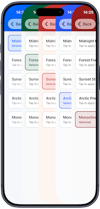
The image above shows the heart of our design philosophy in action. It isn't a collection of different apps; it is a single, cohesive interface demonstrating five distinct "Visual Personas" available within our Light Mode environment.
In many productivity tools, you are stuck with the designer's favorite color. At Streqo, we believe the user should be able to choose the "visual temperature" that best supports their current mental state. We have engineered these themes to move along a spectrum of Saturation and Arousal.
As you can see in our selection menu, each theme serves a specific psychological and accessibility goal:
1. The "Low-Arousal" Tier (Forest-Focus & Arctic-Precision)
- The Visuals: Organic, muted greens and desaturated, icy blues.
- The Engineering Purpose: These themes are built for steady-state productivity. When you are in a high-stress week, bright colors can feel like another "demand" on your attention.
Forest-Focususes nature-inspired tones to reduce eye strain and lower cortisol, whileArctic-Precisionprovides a clean, clinical clarity that removes all emotional noise from your data. - The Accessibility Goal: Reducing visual "noise" to prevent sensory overwhelm.
2. The "High-Energy" Tier (Sunset-Streak & Midnight-Momentum)
- The Visuals: Warm ambers, deep oranges, and rich, dark blues.
- The Engineering Purpose: These themes are designed for visual momentum.
Sunset-Streakuses the warmth of a setting sun to create a sense of reward and "closing the loop" on your daily goals.Midnight-Momentum(as seen in its darker accent) provides a way to transition into lower-light use, making late-night logging much more comfortable for the eyes. - The Accessibility Goal: Using higher saturation to drive dopamine and task-completion motivation.
3. The "Minimalist" Tier (Monochrome-Flow)
- The Visuals: A desaturated, low-chroma aesthetic—stripping away vibrant hues in favor of a muted, neutral palette.
- The Engineering Purpose: This is our Zero-Distraction mode. It isn't "black and white"—it's much more sophisticated than that.
Monochrome-Flowremoves the "emotional" weight of bright colors, leaving behind a neutralized, low-saturation environment. It is designed for the user who wants to see their progress without the visual "loudness" of a colorful UI. - The Accessibility Goal: Providing a middle ground for users who find high-saturation colors overstimulating or distracting.
The Engineering Truth: One Interface, Multiple Sensations
While these five themes look different, they all share a singular technical DNA. We have engineered them so that the Information Architecture remains identical across every theme.
Whether you are clicking through the amber of Sunset or the neutral tones of Monochrome, the buttons, the text hierarchy, and the "Quantum Streak" indicators remain in the exact same spatial locations. This ensures that switching themes doesn't require a new "learning curve"—it only requires a new "feeling."
We aren't just giving you more colors; we are giving you more ways to show up for yourself.
Beyond Color - The Anatomy of an Accessible Button
A button in Streqo isn't just a colored rectangle. It is a multi-sensory signal. To ensure we are building for everyone, every interactive element must pass the "Three-Pillar Test":
| Feature | Implementation | Why it matters for Streqo |
|---|---|---|
| Luminance Contrast | Ensuring a 4.5:1 ratio minimum | Prevents "Visual Erasure" where progress disappears in bright light. |
| Shape Affordance | Clear borders and shadows | Provides "haptic" visual cues for users with spatial processing challenges. |
| Color Independence | Never using color alone to signal success | An "X" is not enough; we use icons + text so color-blind users aren't left guessing. |
The Technical Implementation A Design System of Tokens
To ensure that Streqo remains "adaptive" rather than just "colorful," we do not hardcode hex values into our components. If we did, switching from Forest-Focus to Midnight-Momentum would require a complete re-render of the logic tree.
Instead, we utilize a Design Token Architecture. We define the intent of a color, and then we assign a value based on the active theme.
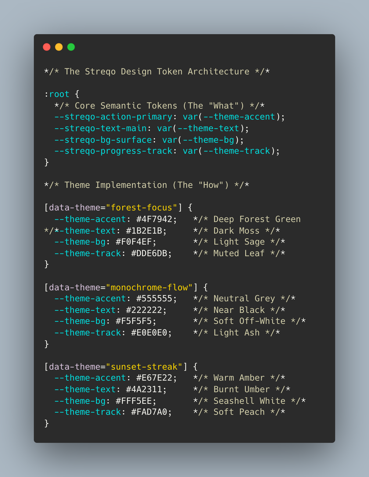
By using this abstraction, we achieve two things:
- Performance: Theme switching is a simple CSS variable swap, meaning zero layout shift (CLS).
- Scalability: We can add a new theme—like Arctic-Precision—simply by defining a new set of tokens without ever touching the component code.
The Implementation Gap The Reality of Building in Public
As I stated in The Skeptic's Corner, Streqo is not built on original research; it is built on attempting to translate existing behavioral science into a functional product. This translation creates a massive Implementation Gap.
We face two critical engineering hurdles right now:
- The Gradient-Contrast Paradox
Our "Quantum Streaks" rely on beautiful, smooth color transitions to represent partial progress (e.g., 25% vs 75%). However, gradients are the natural enemy of WCAG AA compliance. As the color shifts across a curve, there are inevitable "low-contrast zones" where text or icons can become lost. We are currently experimenting with Adaptive Stroke Weighting—increasing the border thickness and darkness of icons specifically when they sit atop low-contrast gradient segments.
- The Cognitive Load of Choice
While providing five themes is a strength, we must ensure that the act of choosing does not become a source of decision fatigue. We are working on an "Intelligent Default" feature—an algorithm that suggests a theme based on the time of day (e.g., Midnight at 11 PM) or the user's current activity level.
We don't have all the answers yet. Every time we solve one accessibility hurdle, a new psychological one emerges. But we are building in public so that your feedback can help us bridge this gap.
Final Synthesis The Future of Streqo
We started with a simple realization: The problem wasn't my willpower; it was the tools.
A tool that demands perfection is a broken tool. A tool that ignores the user's visual or sensory reality is a broken tool.
By integrating WCAG standards into our very DNA, we are building more than just a habit tracker. We are building an environment where progress is possible even on your worst days. We are creating a space where the interface bends to accommodate your life, rather than forcing you to bend to accommodate the app.
Streqo is moving from Rigid Routines to Unstoppable Momentum. And that momentum begins with being able to see, feel, and trust the progress you make every single day.
The journey continues.


